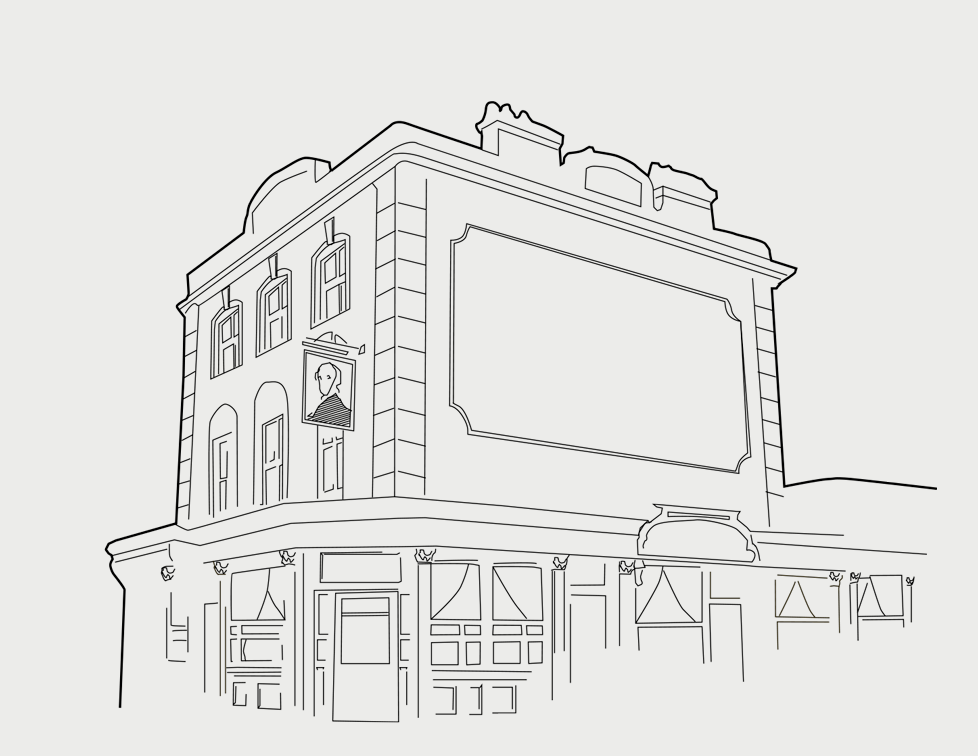
The Royal Albert is a grand old pub in south London. When it came under new ownership, the manager saw an opportunity to introduce a consistent identity across the various materials the pub used.
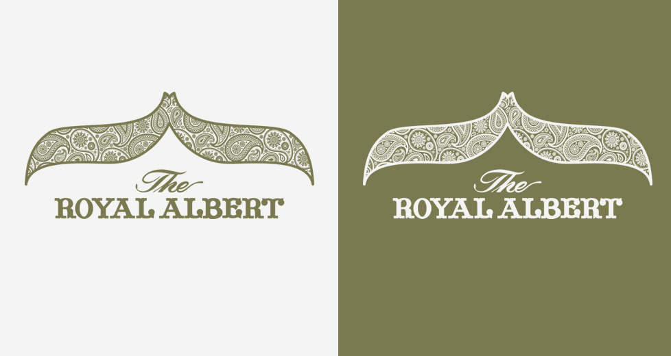
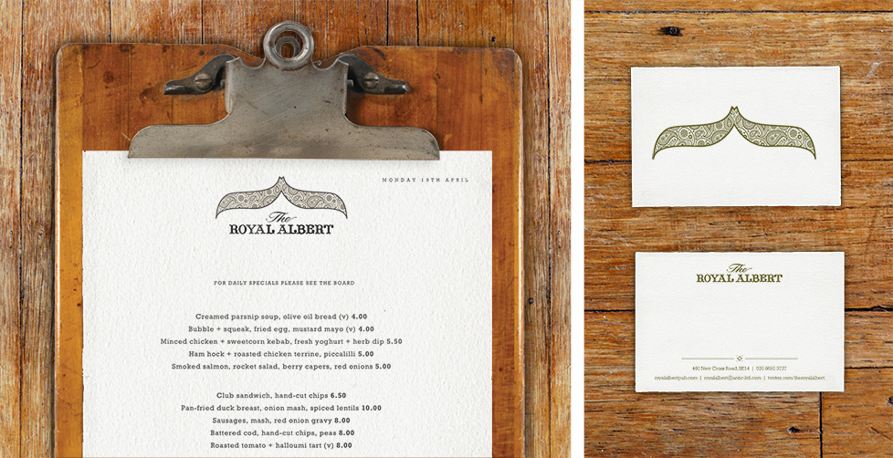
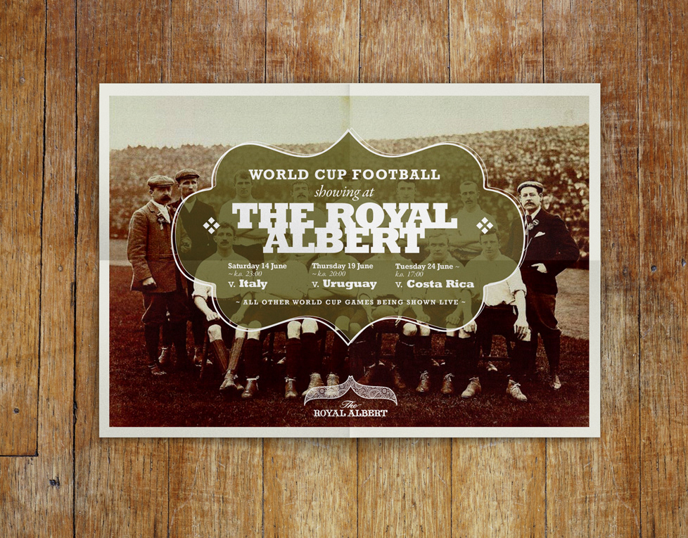
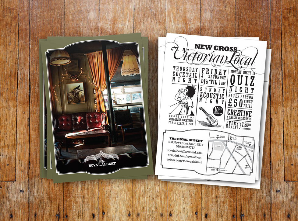
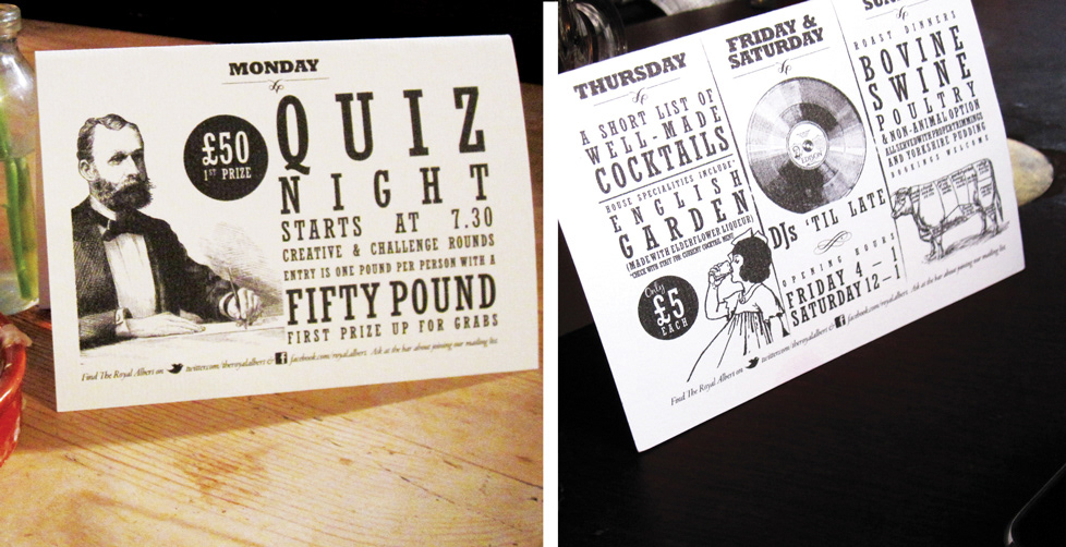
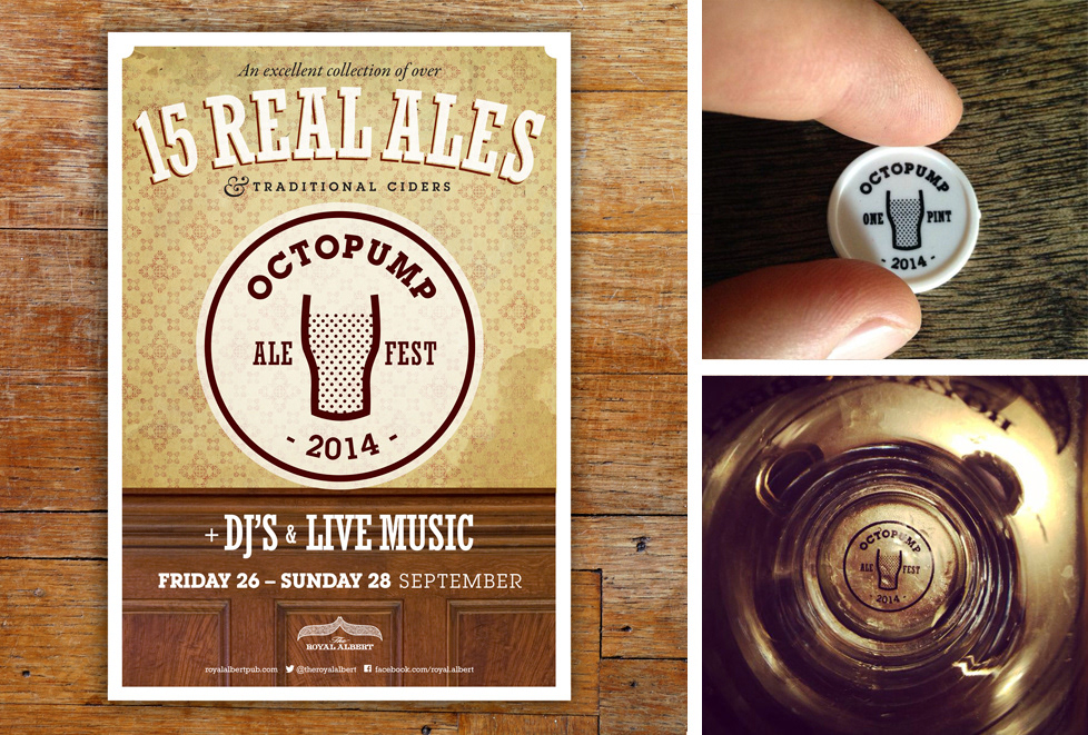
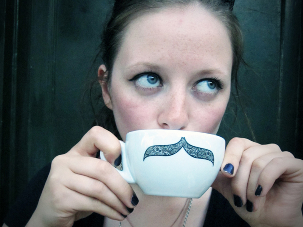
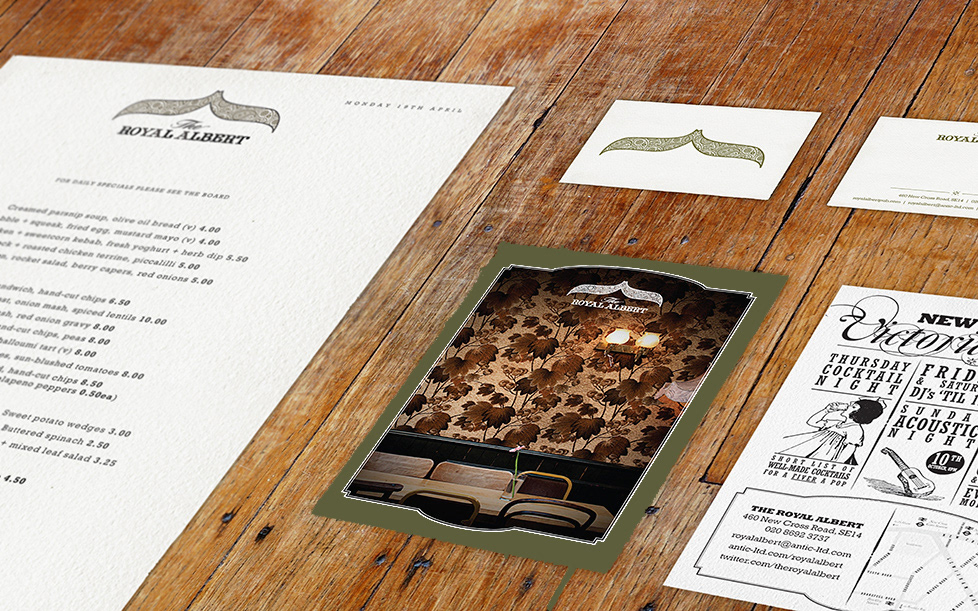
I was asked to create an identity that playfully riffed on the pub's Victorian heritage. I designed the moustache logo to be used across a range of applications. The logotype is based on type used on the pub's hanging sign. Taking inspiration from playbill posters from the period, I stacked type at different point sizes, placed alongside side old cross-hatched illustrations.
The brand was well received, with new uses for the logo still being found over five years after the original commission.